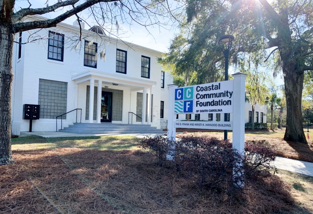
Over the past few weeks, you might have noticed Coastal Community Foundation has a new look. We’ve introduced our new logo and started using bolder colors. We even have a new tagline, “Be the reason why.” So, what does it all mean?
How we got here
Beginning in 2018, we embarked on a mission to upgrade the brand of Coastal Community Foundation. Our goal was to better represent who we’ve grown into over the past 45 years: a truly regional organization serving all nine counties on the coast, one that’s grounded in doing what it takes to create meaningful, equitable outcomes in the communities we serve.
We convened a steering committee of volunteers, including past and present Board members. They helped us select our branding consultant and creator, Landesberg Design, and helped us sift through many options to land on the brand we have today.
Our new brand expression
As we embarked on the process, it was important to all involved that we retain the essence of who we’ve always been as an organization, while also adding elements to reflect how we’ve evolved.
We were founded in 1974 in Charleston by members of the Historic Rotary Club of Charleston — including then-College of Charleston President Ted Stern and local Civil Rights leader Bill Saunders. When they started the organization with a $9,000 investment, they believed that the community foundation model would help people of all backgrounds pool their resources to create meaningful changes in their community.
In our new brand identity, we wanted to capture this founding principle. That, together, we are always better than the sum of our parts. That led us to choose the core of our new brand — the four squares coming together to make a whole.
We also wanted to ensure that our brand was reflective of our nine-county service area. While the seeds of CCF were planted in Charleston, we have grown into a regional operation with four affiliate foundations and offices in North Charleston and Beaufort.
The waves in our logo are distinctly coastal, representing the natural environment our communities share. They also have a deeper meaning: the positive ripple effect we have when we show up for our communities.
The blue and teal of our logo are another nod to our coastal environment, but when taken together with our bright accent colors, the effect is a bold, colorful brand. It reflects our core value to take bold action to address the important issues affecting our communities.
“Be the reason why” is another key element of our brand expression. We consider it a call to action, inviting people to join us in creating vibrant communities by turning bold ideas into actions, and actions into positive outcomes for all.
Thank you
We are so proud of this brand and how accurately it captures who we are and who we strive to be for our communities. We feel immense gratitude for the work of Landesberg Design, who created our brand, our new website and many other elements of our brand expression. We also want to thank Maud Bentley Design and Knight Printing & Graphics for their work in getting us here.
Lastly, we must reiterate our gratitude for the volunteer members of our branding steering committee for their support throughout this process. Thank you, Colleen Troy, Steven Goldberg, Rachel Hutchisson, Victoria Rae Moore, Thetyka Robinson and Angelia Washington for your service.


